Tuesday, July 23, 2013

Loose Tea Leaf Packaging

The product line I chose for this packaging project is loose tea leaf. I'd like to narrow down my focus to a specific type of Chinese green tea named DragonWell because it is the symbol of my hometown and I'm excited to bring something personal to the design. I conceptualize the product to signify peace, calm and delicacy since DragonWell is a pretty high-end tea product. In contrast to fermented Oolong or black tea, the idea way to truly experience the fine quality of DragonWell green tea is to put dried tea leaves into a clear glass teacup for brewing so that we can sea the tender leaves floating. 
Brewed GragonWell tea


The outer packaging will be a bigger square box. The inner packaging will consist of 9 square flat boxes, each (hypothetically) containing about 2-3 teaspoons of dried leaves so that every individual box is good for one glass teacup (about 10 oz of water). I'm thinking of combining traditional Chinese watercolor painting with modern Western design concept.

I went to the Metropolitan Museum for inspiration. Unfortunately, Chinese calligraphy and paintings are not on display. So I checked out Japanese and Korean artworks instead.


I also got more inspiration from the contemporary artwork exhibition when constructing my color palettes. 


Working progress:

  • Logo & Business card: I really the texture and delicacy of Chinese seals so I worked with this concept for the logo. I named the product "Ming" (see the character below), which means superior tea in Ancient Chinese. 

Logo: Ming

Business card front
Business card back

  • Outer box lid: I'd like to bring something personal to this project so I used a map of my hometown and manipulated the texture to make it more hand-made. For the final presentation, the lid will be printed on a transparent piece of paper so that we can see the smaller boxes inside of it.

Outer box packaging

  • Inner box: I made some variations based on the map concept so it connects well with the outer box lid. The watercolor fill is intended to convey a sense of authenticity and delicacy. I'll split the graphic into 9 pieces so each small inner box will be a part of the map and come together like a puzzle piece.
    Inner box packaging
  • Prototype

  • Final packaging product


Thursday, July 18, 2013

Tea Bag Packaging

Some neat tea bag packaging designs that I found:
This tea bag has really cute and warm color design. The leaf-shaped handle on top to lift the tea bag up is also a clever and useful design. 

The texture of the bag and the green "G" make it look so organic.


This is one of the most hilarious and clever design that I came across today. I'm really drawn to the idea of making the tea bag into someone who is "sitting" in your tea cup.
The concept is sort of similar to the one above, making the tea bag the shape of our t-shirts. The whole packaging looks so elegant with the tiny clothes rack.

I like the fact that the tea bag can be split into two independent parts. The bottom part looks great and complete on its own and the top part is doing a good job keeping the tea bag from slipping into the cup.

The tea bags look like candies, which is not a commonly used association (I believe...). But I really like the energy the color palettes adds to the packaging.

DUMBO -- NYC Neighborhood Branding

This group project intends to explore a neighborhood in NYC and brand this neighborhood identity using letter/image combination. The neighborhood that our group researched for is DUMBO, which stands for Down Under the Manhattan Bridge Overpass. It is a neighborhood in Brooklyn, NYC and a premier artist district. 
  • 7.17 Field research: taking photos and sketching ideas
    Manhattan Bridge
Manhattan Bridge: a different view

Brooklyn Bridge
Sketch: playing around with typography
Sketch: preliminary idea

  • 7.18 Logo design: the bridges seem to be good graphic combinations with the word. We decided to focus on the Manhattan Bridge as the graphic representation of DUMBO since the Brooklyn Bridge is more often associated with the entire area of Brooklyn, rather than just DUMBO. 

A simplified graphic version of the Manhattan Bridge

Adding the text

Completing the bridge and adding a somehow ironic punchline 

Playing with color

Cleaning up the design

Integrating DUMBO as a part of the bridge

Final Version


Wednesday, July 17, 2013

Logos that I love


3 (redesigned) logos that I recently came across and enjoy:
This is an unused logo that the designer posted on Dribbble. Although I'm not quite sure what project the logo is for, I really enjoy the dynamics created by the outline of the frog along with the energetic color palette. The logo may be great for something that has a frog component (e.g., as mascot) in branding.

This is a redesign for Google Fonts. I like the fact that the designer chose the letter "f" to work with because the calligraphic and handmade font works really well with the idea of the product. The flow of the stroke goes  quite well that it creates the illusion that "f" is an easy letter to deal with. One thing that I may play around with is the position of the letter and the shading. I'm also curious to know how well it works with other Google products design.
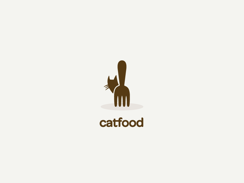
The designer doesn't specify the clients but I feel that the message is pretty clear and strong. The logo is probably for some restaurant or food service. I like the way the font corresponds to the cute, sweet graphic above and that the body of the cat is also the bottom part of a fork. From a more general perspective, the mood of the logo fits well with the food industry. 


Sunday, July 14, 2013

Book Cover Design for Borges 'Library of Babel"

What this book is about?

Library of Babel by Borges describes a universe in the form of a library that consists of countless hexagon galleries and indefinite numbers of books. The first image that stood out to me while reading the story is well-defined geometric forms arranged in a chaotic and incoherent manner. The massive universe is composed endless hexagons so that each gallery is just a tiny little piece of its millions of duplicates. Men living in the library have concluded that since it contains all possible combinations of the 22 orthographic symbols, there must be a book somewhere that is the perfect catalog of the content of the library. Hundreds of people have attempted to travel through the library to seek the book, and as the library is infinite, despair and depression have emerged. I'm impressed to see how massiveness would become an obsession, and more importantly, a distraction that discourages people to live their own life. The despair of knowing that anything that we can possibly create in the future already exists can be so overwhelming that it pulls men in the library from focusing on what they are capable of and pushes them onto a pointless journey for the rest of their life.


My book cover design process

  • 7.15 Summarizing the plot, images and philosophical implications in the book, brainstorming & sketching.
Group discussion summarizing the book
Trying out different concepts on sketchbook: pixel guy, hexagon glasses, books
Trying out different concepts on sketchbook: geometry, alphabet, etc.
  • 7.16 Deciding on the graphic and concept & making 3 iterations of the design. I decided to play around with the alphabet and tried to depict my feelings after reading the book. 
4.25 * 6.87 in. 

6 * 8 in.

6 * 8 in.
  • 7.17 Final version
    4.25 * 6.87 in. 

Saturday, July 13, 2013

A Book Cover Design that I like

A book cover design that I really enjoy:
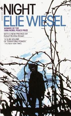
Night by Elie Wiesel
I came across Night in my junior year when I took positive psychology. The book is about the author's experience at the Nazi concentration camps toward the end of the WWII, so it is not a popular reading for classes like positive psychology. Yet, the book stands out to me because despite its thin volume, Night is by no means easy to read. I almost gave up reading towards the end of the story because I felt so overwhelmed by the horror, grief and helplessness that Jewish people experienced during WWII. From a first-person perspective, the book revealed how terrifying and powerful the concentration camps were in terms of destroying people's faith, hope, and most importantly, humanity. However, from my point of view, the true legacy of the book is that it evokes readers to reflect on what human beings are capable of doing and how to prevent tragedies like this from happening again in the future. Night is a constant reminder that brings that part of history into our awareness and warns us to make sure that the past doesn't repeat itself. 

The book cover is the 1982 Bantam edition and it hovers in my mind since I first laid eyes on it. Although I haven't had any formal training in book cover design, I'm still impressed how well the graphic tree branches that mimic the shape of mental fences and the space between each letter that creates a sense of tension complement the content. The cover is the first thing that will pop up in my mind when I think of the book, which probably speaks quite well for itself how powerful and successful the design is.

Wednesday, July 10, 2013

Museum Reflection: Abstract Generation @ MOMA

My favorite pieces from the Abstract Generation exhibition at MOMA:
Cues
I really enjoy the use of overlapping black and white figures to create a sense of progression in this work. Each row seems to tell an independent story, with the far-most screenprints  being the beginning and end and the ones in the middle showing the development of the plot. Yet, the two rows are not completely separate or disconnected from each other because they are composed of the same basic figures.


I've got the money if you've got the time
I'm impressed how well the artist manipulated rigid black and white elements to create such a graphically interesting work. The use of negative space between the tapes adds a lot of power to the dynamics of the piece so that the simple rectangle layout still maintains a sense of vividness. I also like the combination of heavy tapes and handmade-feeling paper in this piece. Both of them contribute to implying that each small rectangle is different from one another to some extent, but that they can all be organized under a cohesive theme.

Tuesday, July 9, 2013

Book

I'd like to make the book project a documentation of my daily life, of what I did and how I felt. So I took pictures of my outfits folded into different gestures and rearranged these photos along with two sentences from our daily conversation:
- How are you? 
- I'm fine.
They are probably the most commonly used greeting in our life, but the inspiration was originally from a 1995 movie named Love Letter directed by Shunji Iwai. My concept was to address the impact of past, so I integrated pieces of handwritten diary with coffee stains and used digitally-made notepad paper as the background. For the final presentation, instead of binding them into a book, I'm thinking of stringing each page and hanging them from the ceiling.

Some prototype pages (trying out an old wall as background):
7.9 Sample Page 1

7.9 Sample Page 2
Revised page details for final presentation: 
Each page is double-sided and consists of the same photos and diary page. I played with a variety of rotation choices to make each back page similar, but not exactly the same as the front page.
7.12 Page 1 front

7.12 Page 1 back

7.12 Page 2 front

7.12 Page 2 back

7.12 Page 5 front

7.12 Page 5 back
Setup:
7.15 Front

7.15 Back