A Book Cover Design that I like
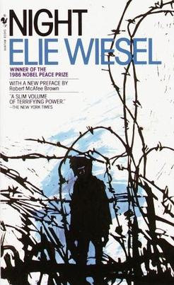
A book cover design that I really enjoy:
 |
| Night by Elie Wiesel |
I came across Night in my junior year when I took positive psychology. The book is about the author's experience at the Nazi concentration camps toward the end of the WWII, so it is not a popular reading for classes like positive psychology. Yet, the book stands out to me because despite its thin volume, Night is by no means easy to read. I almost gave up reading towards the end of the story because I felt so overwhelmed by the horror, grief and helplessness that Jewish people experienced during WWII. From a first-person perspective, the book revealed how terrifying and powerful the concentration camps were in terms of destroying people's faith, hope, and most importantly, humanity. However, from my point of view, the true legacy of the book is that it evokes readers to reflect on what human beings are capable of doing and how to prevent tragedies like this from happening again in the future. Night is a constant reminder that brings that part of history into our awareness and warns us to make sure that the past doesn't repeat itself.
The book cover is the 1982 Bantam edition and it hovers in my mind since I first laid eyes on it. Although I haven't had any formal training in book cover design, I'm still impressed how well the graphic tree branches that mimic the shape of mental fences and the space between each letter that creates a sense of tension complement the content. The cover is the first thing that will pop up in my mind when I think of the book, which probably speaks quite well for itself how powerful and successful the design is.

No comments:
Post a Comment