3 (redesigned) logos that I recently came across and enjoy:

This is an unused logo that the designer posted on Dribbble. Although I'm not quite sure what project the logo is for, I really enjoy the dynamics created by the outline of the frog along with the energetic color palette. The logo may be great for something that has a frog component (e.g., as mascot) in branding.
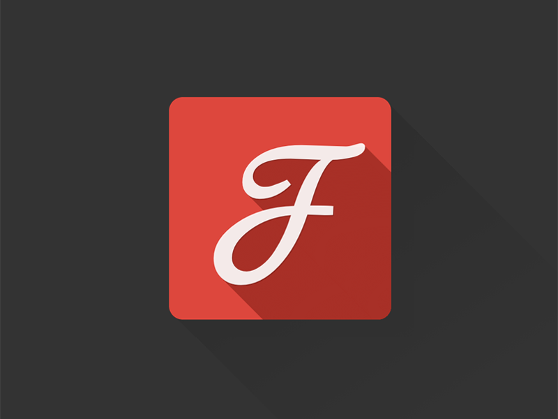
This is a redesign for Google Fonts. I like the fact that the designer chose the letter "f" to work with because the calligraphic and handmade font works really well with the idea of the product. The flow of the stroke goes quite well that it creates the illusion that "f" is an easy letter to deal with. One thing that I may play around with is the position of the letter and the shading. I'm also curious to know how well it works with other Google products design.
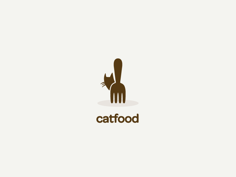
The designer doesn't specify the clients but I feel that the message is pretty clear and strong. The logo is probably for some restaurant or food service. I like the way the font corresponds to the cute, sweet graphic above and that the body of the cat is also the bottom part of a fork. From a more general perspective, the mood of the logo fits well with the food industry.
No comments:
Post a Comment